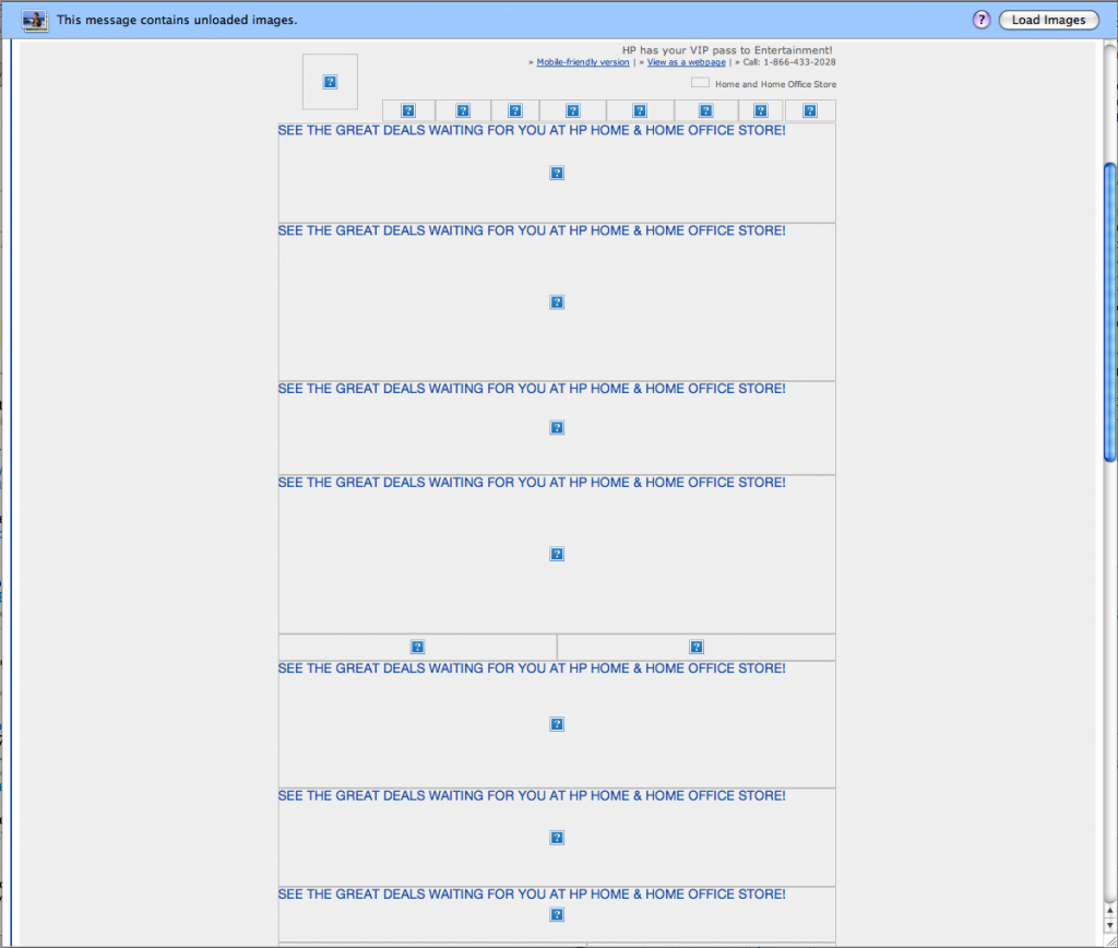
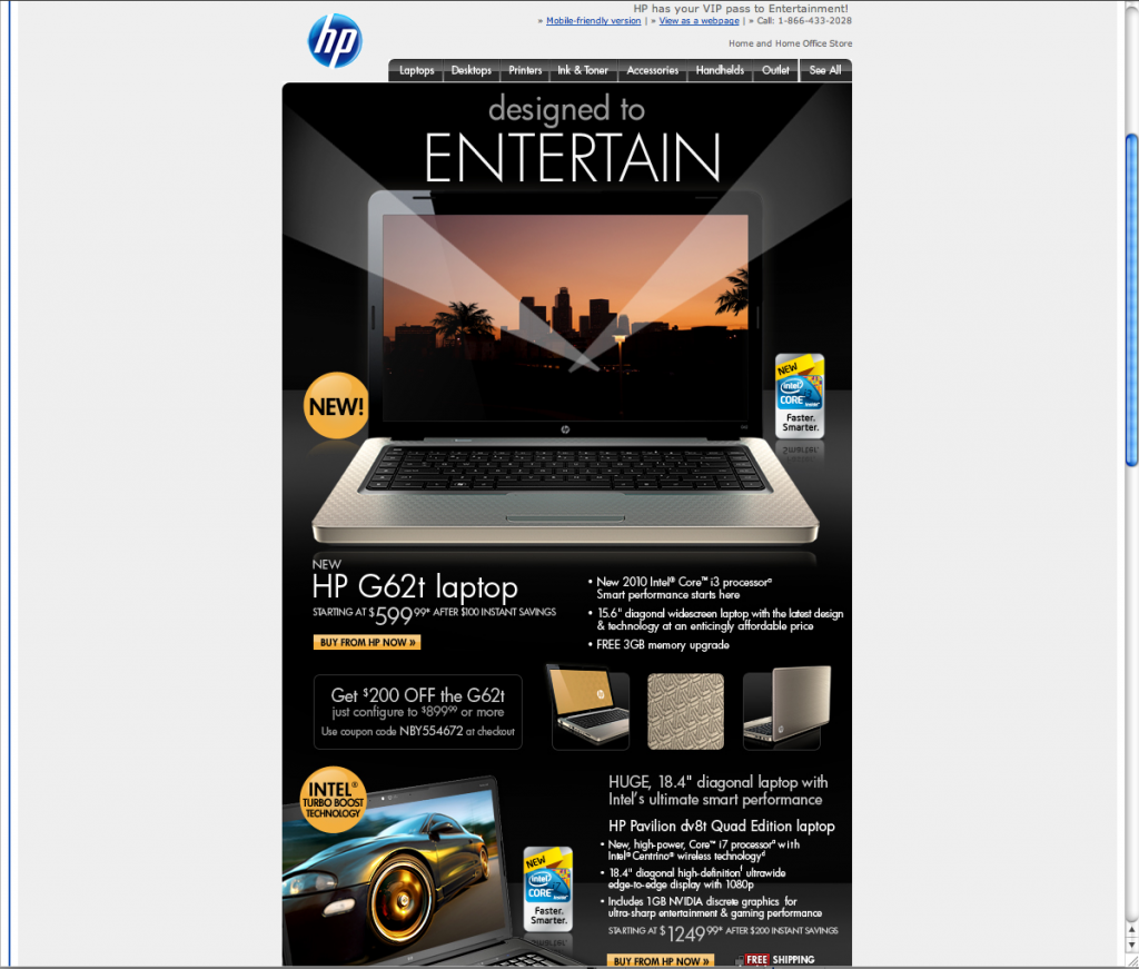
An Example of Alt Text & Slicing Done Right
If you read our previous blog post "Creating Image Based Emails and Using Alternative Text and Slicing" you are very well informed about how to use alternative text and slicing to your advantage. You may be wondering however, what a good implementation of these tactics look like. We recently received an email from HP that we believe uses alternative text and slicing with style and class.


