Creating Email with Responsive Design is Now Possible
Admail.net is releasing a beta version of its Email Builder with responsive design tools.
Admail.net, a Cleveland based email marketing company, has announced it will launch a beta version of a new email template builder focused on responsive design this week.
The Responsive Design Email Builder includes new features such as drag and drop editing, on the fly image insertion with unlimited storage, new professionally designed responsive templates, an easy to use hyperlink embed tool for both images and text, and the ability to export your HTML source code to use with other email systems.
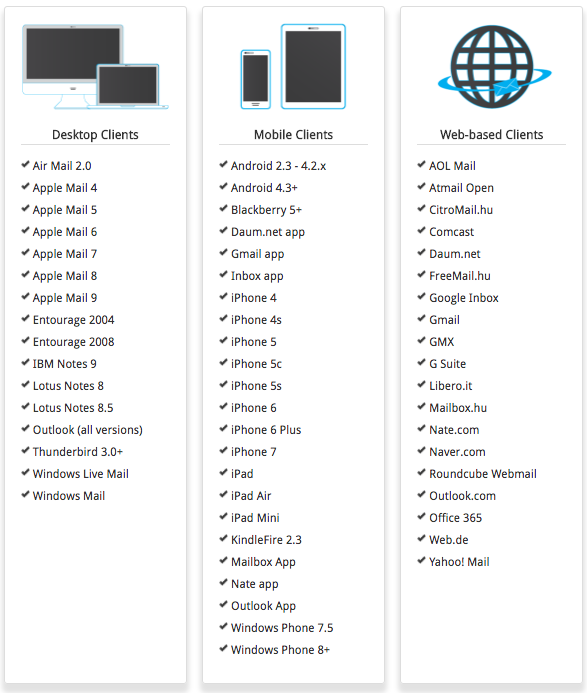
Responsive design is a method developed out of the necessity to have online material appear correctly under conditions that can rapidly change depending on user interaction. An email or website created with responsive design will appear as expected at multiple resolutions and on most devices.
Robert Hicks said, “Today, 65% of email is read on a mobile device. Designing with this in mind is crucial to getting the most out of your email marketing efforts. Whether it’s an Android or Apple device, smartphone or tablet, responsive design emails will always look their best.”
While many companies are chasing social media or the newest thing, Admail.net recognizes that mobile is the future of online and email marketing. The Responsive Design Email Builder was created to prepare customers for what’s ahead and give them the best chance for success.
Market data has shown that email marketing is still the best results-oriented marketing tool for real businesses. Low costs and ease-of-use make email marketing a very strong return on investment (ROI).
Since 1995, Admail.net™, a List Media® company, has provided email marketing and database management systems serving customers in the entertainment, government, retail, finance and manufacturing industries.

