Our Philosophy on Responsive Design for Email
Designing email for a mobile market is among the most pressing issues in email marketing today.
This is an obvious truth for everyone in the email marketing business, but the question you are probably asking yourself is, "How do I deal with it?"
To have success with email marketing, your message must be attractive and functional on many platforms. The number of users reading email on their mobile devices is already at a substantial 40% (at least), a percentage that we believe will continue to increase.
Some email marketing services have adopted the idea that responsive design is the best way to prepare email for mobile devices. When an email is designed to be responsive, it will display differently depending on the display size of the device. In order to know the size of the device, a certain type of code called a media query must be used. Media queries are functional on most mobile platforms.
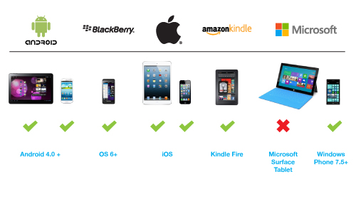
Media queries are successful on most devices, but only if your list members are using a relatively up-to-date version of their chosen platform. Responsive design and media queries can make even the most complicated templates look great on mobile. We use responsive design in our very own website, but the unfortunate truth is that design for email is much different than modern website design.
Admail.net supports responsive design through our upload HTML feature. We believe that if you're going to tackle this emerging technology, you should have someone on staff with the ability to write the code themselves. This is important with responsive design because complications can and will arise. Problems can occur when displaying responsive designs on non-mobile platforms and in third party mobile email applications. Media queries are often not supported in these cases and responsive design may appear in a way you may not expect.
That is why we have chosen not to take the leap to responsive design and why we are holding off on making our templates fully responsive. Our templates already display beautifully on mobile devices without using responsive design or media query. Customers can rest assured that we have a finger on the pulse of mobile email design and we're keeping a close eye on all of the changes. We're more than happy to support our customers who do want to dabble in responsive design, but we're sticking with what works consistently for now. We know that the mobile platform is growing and here to stay. It's a big part of our development plans moving forward.
In lieu of responsive design, there are traditional ways of making your email mobile friendly. A few simple methods are listed below:
- Make links and buttons big enough for people to accurately touch with their fingers on a small screen.
- Using a single column format so it's only necessary to scroll up and down rather than side to side, which is the standard functionality on mobile phones.
- You should use text sizes that are easy to read, anything below 14px for copy is probably too small.
- Avoid low contrast between fonts background colors and make copy short and informative.
- Short subject lines are also more important with mobile as well as there is less space to display a lengthy subject line.
Following these rules will help you in your quest to be mobile friendly, but using your own mobile device should help you discover even more ways to do so. Email marketing is something that we're all familiar with and common sense can go a long way. If you have any questions or need specific advice, please contact me with questions at dan.lukens@admail.net. I'm always happy to help!
- Next: Admail.net IP Monitoring
- Previous: Writing HTML that works for Email

